Before starting this evaluation question I decided to look at the conventions of music videos and in particular rock music videos due to this being the genre of my song.
So what are conventions? Conventions are the ingredients that are usually seen to make a media product.
Music Video
A music video is a short film or video that accompanies a piece of music or song. The majority of modern music videos are made and used as a marketing technique to promote an artist/band or song.
Conventions of music videos are the ways things are done within the video, it also helps to decipher the genre of the song. These conventions vary depending on the genre of music. However some general conventions are: the artist/band is shown performing, the lyrics of the song influence the visuals, the pace of editing matches the pace of the song and the code of dress reflects the genre of music.
Conventions of music videos are the ways things are done within the video, it also helps to decipher the genre of the song. These conventions vary depending on the genre of music. However some general conventions are: the artist/band is shown performing, the lyrics of the song influence the visuals, the pace of editing matches the pace of the song and the code of dress reflects the genre of music.
More conventions of music videos:-
Camera Shots: Tend to include many long shots, close-ups and mid shots. Create emphasis on the artist, location and emotions. Close-ups are also used to reflect the lyrics with the lip movement of the artist.
Camera Movement: Used to follow and track the artist/band.
Costume: Goes with the scenes in the song and reflects the genre of music.
Colour: Sets the mood of the song through creating an atmosphere e.g. dark colours are used more in rock songs and bright colour are used more in hip-hop and pop videos.
Editing: Jump cuts are commonly used. Reaction shots are used for music videos with a narrative. The pace of the editing is in sync with the beat of the track/song.
Lighting: Artificial lighting is commonly used, the lighting helps set the mood of the song.
Conventions of rock music videos:-
Usually dark/deep colours
Displays the band performing on stage
Uneasy camera movements
Hand-held shots
Shows artist/band throughout the video
Some special effects
Usually a calm setting, but this changes when the beat kicks in
May be in black and white
Close-ups of artists and characters shown in the video

Linked to the characters is the theme of the song, we had to make sure the characters where right to portray the theme which we wanted to get across to the audience.We met the convention of having the theme of love, this was shown in the narrative part of the video as well as through the lyrics. We also met the convention of the visuals linking to the lyrics.
This video doesn't meet the conventions of the main characters being the band members and instead the video tells a story of a milk carton on a quest to find the guitarist Graham Coxon. It does however meet the conventions of having the theme of love as the milk carton finds a strawberry milk carton on his journey as well as danger due to him avoiding death from lawn mowers and trash-kicking kids. The love theme is a negative one when linked to the milk cartons due to the strawberry milk carton being squished. However the theme of love with the family as they finally find their son - the guitarist.
There are lots of conventions concerned with Mise en-scene. When planning our video we took into account whether or not we would be using these conventions and the reasons why. We met the convention of having casual clothing in our video, such as jeans. We chose to use this convention as the majority of people wear casual clothing and therefore would be able to relate to the video. We used the convention of a leather jacket but only in parts of the narrative. It was worn by Henry and we didn't want to over-use this convention as we thought that this could make the video look 'tacky'. However we chose to not meet the convention of sunglasses, silver jewellery or tattoos, this was due to the age that we wanted our characters to look and the personality we wanted to be created by them.
The majority of rock music videos have the performance parts with their actors having extreme expressions and body-language. This is done to show their passion for their music. A good example of this is
We met the convention of using stage lighting for the performance part of the video. We used 'sunset' lighting which is calming, this isn't a convention of rock music videos but set the tone of the song better. This type of lighting has been used in a number of different rock music videos but not the majority. One video that uses similar lighting is Chad Kroeger - Hero For parts of the performance we used dark colours by changing the contrast and brightness, low key lighting is a convention of rock music videos and a good example of this is Aero-smith - I Don't Wanna Miss A Thing . For the narrative part of the video we used natural daylight.It depends on the theme and tone of the song to what style and key of lighting is used.


Chad Kroeger - Hero

Aerosmith - I Don't Wanna Miss A Thing

We used the convention of make-up in our video, we met this through the female in the video wearing a good amount of make-up. We also met the convention of the men not wearing make-up in our video, there are some rock bands that do have the men wearing extreme make-up but these bands fit under the glam rock genre rather than just rock. Some rock bands/artists choose for the males to wear eye-liner/eye make-up but we didn't think that this suited the song or the tone that we wanted to put across to the audience.


As you can see above we met the generic convention of having instruments in our video, these included electric guitar, bass guitar and drums. We did however choose to challenge the convention of having a microphone on stage but we did have amps. The instruments are one of the most vital things for a successful rock video. Other props we used are a photo-album, a beer-bottle and pen&paper. Beer-bottles can be used in rock music videos but are more commonly seen in hip-hop or rap video.
In our video we used a number of different camera shots, these included long shots and mid shots for both the narrative and performance, close-ups and panning shots just for the performance. These met the convention of camera shots both in a general and in a generic way, as these shots promote the artist and establish the band. We only used one hand-held shot which was in the narrative part of the video and was of the love interest.
When editing our video we chose to include a number of fades as well as jump cuts. Both these edits are generic conventions of rock and we chose to meet these and use them as it was effective and beneficial for our video. We also used a page roll for our photo-album scene. Often a rock video will either choose to go with more subtle editing techniques such as fades and jump cuts, where as other choose to go for more exaggerated edits such as star wipes and page rolls etc. We chose to use a mix of these edits due to the song having a serious story-line - seen in the narrative but it also having a 'fun' 'humorous' side to it - seen in the performance and linking scenes.


There conventionally isn't any titles at the beginning or end of a rock video, however we chose to have titles at the end of the video in the bottom left hand corner of the screen. We thought that this would be effective as if it was the first time someone had seen the music video then at the end they would find out what the song name is as well as the artists name and album name.

It is a convention however to have an intro to the music video which introduces the main characters and sets the story line. We met this convention and developed it so that we also added an outro to end the video. For our outro we decided to go with a humorous tone. This is a convention that many rock bands/artist choose to go with. However more 'serious' rock groups do not.
We had both a performance part of the video and a narrative part, this is a convention of rock music videos. As well as this we also had a separate scene which linked the narrative and performance together which isn't a generic convention of rock. We have a ratio of about 60:40 in terms of performance:narrative.
This video Foo Fighters - Learn To Fly is a video that challenges the structure of a rock music video this is due to it having a narrative that runs through the whole of the video with no performance.
In conclusion for our video here are some of the conventions we. . .
Used:-
Casual clothing
Stage Lighting
Performance and Narrative
Fades, jump cuts
Camera shots
Make-up
Theme
Visuals linking to lyrics
Developed:-
Intro and Outro
Instruments
Performance with no audience
Lighting
Characters
Locations
Challenged:-
Tattoos, silver jewellery and sunglasses
Titles
Digipak
A digipak is a style of packaging which is able to hold one or more CD/DVD's. The outer cover is made of card rather than plastic and opens up like a book to reveal a plastic tray which holds the CD/DVD. It is a style of CD/DVD packaging that promote the artist.
Conventions of digipaks:-
The name of the Artist/Band
The name of the Album
Track-listing (includes bonus extra's such as 'behind the scenes and/or 'making of')
Website Addresses
Record Label branding
Pictures of band members or relevant visual imagery to sell the band
Price
Credits
Recording Information, Producer, where it was recorded and when
Lyricist
Logo
Bar-code
DVD/CD logo
Website banner
Conventions of rock digipaks:-
Features the Artist/Band, central to the frame
Uses a direct mode of address
Lower case or capital lettering is used
Large band name, with the album name slightly smaller
Minimalistic, and has all info that the audience needs to know
The colour scheme from the front cover is carried onto the back
Clothing often mimics the style of the music.
Iconic logo that relates to the band/artist

This is our digipak

Here is the digipak for The Script - Science and Faith. They fit in to the genres alternative rock, pop rock and indie pop.
This is a digipak meets some of the conventions of digipaks however it chooses to develop a number of them. For example the first thing you see when looking at the front cover is two hands grasping each other. This is an image of the artist/band member but only part of them and not what you typically see of it being either their head or full body. It meets the convention of the band name and album name being on the front cover as well as the album name being smaller than the bands name. It meets the conventions of the information it has on it, such as the bar code, the production company's logo, copyright information and websites. It does meet the convention of having track-listing on the back page of the digipak, but develops this by not having it in the typical top left hand corner and instead having it in the top right corner.

Here is the digipak for Oasis - Don't Believe The Truth. They fit into the genre rock, Brit pop and alternative rock.
This digipak has developed many conventions, such as the album name - Don't Believe The Truth is on the album cover, however it is part of the picture rather than just font on the cover. As well as this the band name - Oasis is actually their band logo which they put on all of their CD's. This creates good brand identity as well as develops the convention of titles. The track-listing again develops the convention, instead of the track-listing being in the top right corner it is central on the back of the digipak. It is developed due to the track-listing being there but being in a different position. On the front panel it meets the convention of having just capital lettering for the album name, and just lower case lettering for the band name. However on the back panel it challenges this convention due to the font being a mix of both capital and lower case lettering. This digipak also meets the generic convention of using dark colours, and the colour scheme on the front being the same as the colour scheme on the back. It also develops the convention of the bar-code production information and copyright information. It is conventionally at the bottom of the back panel whereas this digipak still has these details but isn't at the bottom but at the side instead.

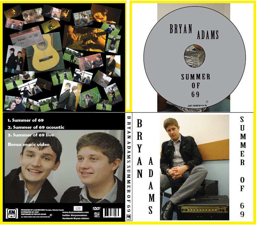
Here is the digipak for Bryan Adams - 11. He fits into the genre rock and soft rock.
On the front of the digipak it features the artist central to the frame, this is a generic convention of rock digipaks that this one meets. However it doesn't meet the convention of direct mode of address. The lettering is all in capitals which is a generic convention of rock digipaks as well as a convention that Bryan Adams likes to use. It also meets the convention of having the same colour scheme throughout the digipak - red, white and black. These are also generic colours which are often used for rock products.

This is the front panel of our digipak.
We chose to meet the convention of titles on the digipak and have the artists name is bold so it can clearly be seen from a distance, with the album name being slightly smaller so it didn't look out of proportion, this allowed us to meet the generic convention of titles on a rock digipak as well as the general convention.

This is the back panel of our digipak.
On the back we used the generic convention of the colour scheme, conventionally it is black, white and red. We did use part of this colour scheme apart from the red. The reason we didn't use red on the digipak is that due to the images and font style it was hard to read and therefore would detract from the overall effect of the digipak. We also met the convention of what information is shown at the bottom of the back panel. This included the record logo and information, the copyright information, where and when it was recorded. As well as websites (URL, Facebook and twitter), the DVD and CD logo, bar-code and smart phone scanner. These are all general conventions for a digipak as this information is often used/required by the consumers.
This is the spine of our digipak.
We wanted to keep our spine simple and easy to read, to achieve this we thought it best to meet the typical conventions of a spine for a digipak. We stuck with the convention of having capital lettering. We also met the convention of having the production company logo on the spine.

This is the inside left panel of our digipak.
Instead of having an image of the band or lead singer again, we chose to have any images which were related to the narrative, performance or linking scenes of the video. This isn't conventionally done the way we have done it, scattered on a page. We chose to challenge the convention of having lyrics of the song or only one image as we thought that it would look too simple.

This is the inside right panel of our digipak.
We chose to meet the convention of the CD being silver, on the CD we had the required information. This included the artists name, the album name and the production company and copyright symbol. Behind the CD we have a image of the lead singer. In contrast to the front panel, the lead singer isn't making direct eye-contact or direct mode of address to the audience.
This is the whole of the digipak.
When choosing the colour scheme for the digipak we chose to meet the generic convention of black and white. However we chose to develop the convention of having the same colour scheme for the front and back. We did use the same colour scheme but alternated the background colour for the panels, with the front being white and the back being black.
In conclusion for our digipak some of the conventions we. . .
Used:-
The Name of the Artist/Band
The Name of the Album
Track-listing
Website Addresses
Record Label branding and Information
Bar-code
DVD/CD logo
Developed:-
Colour scheme being the same throughout (background colours)
Challenged:-
Minimalistic (inside left panel)
Poster
A magazine advert is a slot that will appear in a magazine, in this space there will be an advert promoting or selling an item/product. In our case a digipak.
Conventions of posters to advertise a digipak: -
Name of the artist/band
Name of the album/single
Release date
Place available for purchase
Brand identity
Main image e.g. cover/logo/band/prominent image
Use of new media e.g. websites/Facebook/twitter
Record label
Reviews and ratings
Genre of the band is reflected in the text/colour/font/image
Text saying "includes the singe. . ."

We chose to meet the convention of the titles the same way we did on the digipak. Both the artists name and the singles name is in capital lettering and black font - this is the same as what we had on the digipak. We also used the same image that we had on the front of the digipak, the image is of the lead singer with him making direct eye-contact which is a generic convention of rock posters due to the singer/band members being confident.
We developed the general convention of having the release date, we didn't have the actual date that the digipak is released, but we did have 'out now' in capital lettering which is a generic convention of posters to advertise a rock digipak/CD. We met the convention of having the use of new media, this included the website, the Facebook and twitter addresses.
We used the convention of having the record label logo, we placed it in the bottom right hand corner, above this we included a smart-phone scanner which isn't a convention of posters to advertise a rock digipak poster. We also put logos for where the digipak is available to purchase - iTunes and HMV. We used the convention of having a star rating. we chose to have Rock FM as the rater, due to this being a radio station from our genre of music.
Here are some posters that I analysed


Here is the poster which is there to promote the Green Day - Warning digipak/CD.


Here is the poster which is to promote the Green Day - Bullet In A Bible digipak/CD.


Here is the poster that is to promote the Green Day - American Idiot digipak/CD.
All of these posters have effective brand identity, they are all from the same band and have iconic signs that are recognised by their fans/target audience. They are very similar to their digipaks that they are promoting and are simple so don't over-power their audience/target market. The colours used on two of these are the generic rock conventions used by posters advertising a rock digipak - red, black and white. This makes the posters stand out to the people that it is trying to target.
In conclusion for our poster some of the conventions we. . .
Used:-
Artists Name
Album/Single Name
Place available for purchase
Use of new media
Reviews and Ratings
Main image
Developed:-
Release Date
Challenged:-
Text saying "includes the single. . ."
We didn't challenge many general conventions of posters as the best way to display the information which was necessary was to stick to these conventions or to develop them slightly to best suit our individual piece.