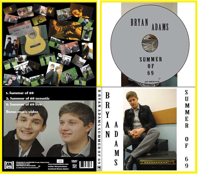
This is our final digipak. We created our digipak through using Adobe Illustrator CS4.

This is the front panel of our digipak.
The front panel background is white, with the font (Birch Std) being in bold and the colour being black. The font on the front of the digipak is the same that is on the spine and CD. The image shows the lead singer of the band sat on an amp with his leg lent on another smaller amp, he is making eye-contact with the audience with a relaxed body-language, we felt that this helped to connote the mood of the song on the digipak. He is the only person on the front of the digipak, this helps to show his importance. In the music video, the lead singer is seen near an amp in the majority of shots, therefore it is recognisable and is related to the music video, for this reason we chose to have this as the image on the front of the digipak.
This is the spine of our digipak.
For the spine we decided to have it very basic. We only included the artists name - Bryan Adams, the single name - Summer of 69 and the record labels logo. This meets the conventions of a digipak's spine. It also meets the generic convention of rock as the font is in capitals and bold. We used the same font which we used on the front panel of the digipak. We put a space between each letter and two between each word, this makes it easier to read due to the words not being bunched up together.

This is the back panel of our digipak.
We decided to have the background of the back panel black. The image on the back panel includes the lead singer who can be seen on the front of the digipak, and the lyricist. We chose to have these two people as these are the first people who are seen in the music video. As well as this, these are the people who help link the performance and the narrative together. We put the information at the bottom of the digipak, this is conventional. The information at the bottom includes the record labels logo, the production and distribution information, the copyright information, websites, the bar-code and QR code are also at the bottom of the digipak along with the DVD and CD logos. We changed the track-listing from the colour red to white. We felt that this was best as it made the track-listing easier to read as well as fit with the colour scheme of the whole digipak.

This is the inside left panel of our digipak.
For the inside panel we chose to have a number of pictures which were related to the music video, this included both narrative, performance and the part linking the two together. All of the pictures are different sizes and angles as it draws the viewers eye into an image which they individually spot first. With these photos linking to the music video, it makes the digipak recognisable to those who have seen the music video and vise-versa.

This is the inside right panel of our digipak when the disk is in place.
We followed conventions when it came to the disk which is to go in the digipak. The colour is often used for CD's. We chose to have no picture on the disk as we wanted to keep the disk simple, we then decided that we would have an image of the lead singer behind the disk.

This is the inside right panel of our digipak when the disk is not in place.
On the inside right panel behind the disk is an image of the lead singer lent up against a wall, he isn't making any eye-contact with the viewer which is contrasting to the image on the front panel of the digipak. The background behind the image is white as this separates the big image from the smaller ones on the left inside panel.
No comments:
Post a Comment